Slight change to this client’s logo…they are branching off and adding a new speaking series in November. So, why not add a small color detail to the logo which makes it POP! I think the leaf needed to be accentuated and it really is representing ‘growth’ as the client’s ideas are evolving into something more inclusive and …well kind of means they are ‘branching out’. đ
Tag: reiki

Print-ready ad for magazine for a client www.reikiassociates.com
Currently doing a little of everything as usual. Above is a print ad for a magazine for a client. Keeping to her new branding style I created this card both vertically and horizontally.
I will also be having my very own craft table at this conference (I confess to know little about Reiki itself) but it’s a great opportunity to show some of my work and hopefully get a few sales. My plan was to bring some prints…perhaps some Nez Perce Style necklaces…porcupine quill work…and a few Rustic Benches pieces we do (cutting boards and candle holders).
My Reiki Associates client is getting ready to hold their 2nd annual reiki conference this spring, entitled: “Enriching Me and My Reiki Community”. Speakers, workshops, exercises, and great food throughout the day will engage numerous practitioners, artists, and those seeking to learn more about reiki.
Looking to the future, for this to be an annual gathering, they requested a separate logo from their own branding. A substantial tree with numerous stars glowing through (they saw the light and energy of the stars to be representative of their community of practitioners 
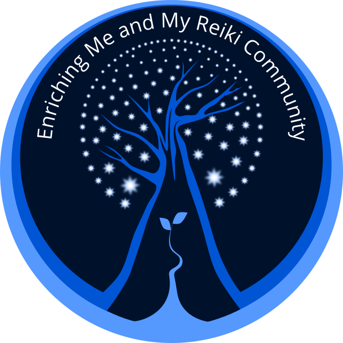
and clients) is an image they wanted to employ.
The small shoot with two leaves growing from the base was suggested to add another layer of meaning to this logo. It was meant to represent new growth, change and re-birth; a fresh and organic energy which can be associated with the reiki practice. I felt that the smaller plant balanced out the larger and solid image of the tree.
Magazine/Newspaper Ads
A full-color ad used to promote the upcoming conference. I used the new logo and extended the colors to the rest of the space. Making each bit of information stand out on it’s own, with clarity and space so as not to feel crowded and without overtaking the main image was my goal for doing a small ad. The logo is completely scalable; keeping it sharp and appealing even when used at a very small size.
Reiki Associates  (http://www.reikiassociates.com/) contracted my services to update their business card to reflect the new look of their brochure.  A two-sided, full-color card with the ability to write 3 appointment dates on the back as a handy reminder for clients.
In addition, an ad used in the Humm, for their upcoming conference. The client is going to be using a separate and distinctive logo for this reiki conference. Yet to be finalized, we used only one element from that logo, a tree, in the interim.
A lovely client had requested a re-do of her business’s brochure. I went with a fresh, cleaner look. I thought the butterfly needed to be simplified and more prominent. My intent was to keep her themes but to just step to the side slightly. I altered the color/text/imagery just enough to not be jarring and to keep her identity. I approach it like refreshing a room…on a budget đ  You don’t throw everything out, you just clean it up, re-paint, edit, pry open the windows, allow a little bit of FRESH in.
Follow Along