Kabeshinàn Minitig Pavilion on Victoria Island
(November 2017)
A beautiful character building to display some art and crafts right in the heart of Ottawa, Ontario.


Art. Design. Illustration. by Star Horn
Kabeshinàn Minitig Pavilion on Victoria Island
(November 2017)
A beautiful character building to display some art and crafts right in the heart of Ottawa, Ontario.


The new logo was the result of a new program initiated by TeamPlayer with the assistance of the Perth Blue Wings Junior Hockey Club. With no recreational hockey program being offered in Perth, TeamPlayer has decided to offer a Sunday morning program for kids who do not want to be in minor hockey (with the costs, time commitments, and emphasis on competitiveness, many kids are left out of the sport in small towns) yet still want to learn the sport.
The name of the new program is ‘Recreational Hockey & Leadership Program for Kids!‘ and the team will be called TeamPlayer Junior Blue Wings. My job was to combine both logo’s while making a new identity for a kids program. It’s always tricky attempting to combine two logo’s which are completely different in style and color and to unify them into a new identity. I always think ‘simpler is better’. By concentrating on using the one word ‘Junior’ and the color orange found on the TP logo as the section that stands out, I think it came together. By adding the the double blue circle, taken from the Blue Wings logo, to keep it looking uniform and in one shape also tidied it up.
A print ad was made for the local newspaper (see above). The logo was used on social media to get interest and registrants -mostly on Facebook by using their advertising feature which comes at a reasonable cost. The next step is working with the local printer to get hockey jerseys and possibly a couple of coaching jackets with this logo. I will follow up with pictures when that gets accomplished.
Slight change to this client’s logo…they are branching off and adding a new speaking series in November. So, why not add a small color detail to the logo which makes it POP! I think the leaf needed to be accentuated and it really is representing ‘growth’ as the client’s ideas are evolving into something more inclusive and …well kind of means they are ‘branching out’. 🙂

This ad is to be printed in Tone magazine

The original logo as seen in Tone’s online magazine.

Print-ready ad for magazine for a client www.reikiassociates.com
Currently doing a little of everything as usual. Above is a print ad for a magazine for a client. Keeping to her new branding style I created this card both vertically and horizontally.
I will also be having my very own craft table at this conference (I confess to know little about Reiki itself) but it’s a great opportunity to show some of my work and hopefully get a few sales. My plan was to bring some prints…perhaps some Nez Perce Style necklaces…porcupine quill work…and a few Rustic Benches pieces we do (cutting boards and candle holders).

Various Bone & Bead Wristbands

Mixed Hardwood Cutting Boards

Porcupine Quill Earrings
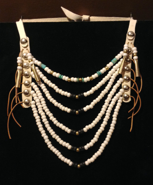
Small Nez Perce Style Necklace

Bird & Wampum Prints
My Reiki Associates client is getting ready to hold their 2nd annual reiki conference this spring, entitled: “Enriching Me and My Reiki Community”. Speakers, workshops, exercises, and great food throughout the day will engage numerous practitioners, artists, and those seeking to learn more about reiki.
Looking to the future, for this to be an annual gathering, they requested a separate logo from their own branding. A substantial tree with numerous stars glowing through (they saw the light and energy of the stars to be representative of their community of practitioners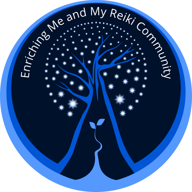 and clients) is an image they wanted to employ.
The small shoot with two leaves growing from the base was suggested to add another layer of meaning to this logo. It was meant to represent new growth, change and re-birth; a fresh and organic energy which can be associated with the reiki practice. I felt that the smaller plant balanced out the larger and solid image of the tree.

A full-color ad used to promote the upcoming conference. I used the new logo and extended the colors to the rest of the space. Making each bit of information stand out on it’s own, with clarity and space so as not to feel crowded and without overtaking the main image was my goal for doing a small ad. The logo is completely scalable; keeping it sharp and appealing even when used at a very small size.
Some years back I drew this picture on a light yellow paper in black ink. Then before I thought carefully, I framed it at a good expense. Photographing it or scanning it before I did this would have been smart. But hindsight is 20/20!
It was part of a whole series of similar drawings using black and white, blank space, negative and positive space, real objects, natural objects, celestial objects, and imagined objects or beings. Most involved images interpreted from my own Mohawk background; clans, traditional clothing, myths, beliefs, common symbols and my love of the power & strength to be found in my people and the natural world (Mother Earth, animals, the sky, water, fire, etc).

By re drawing in Inkscape (a vector drawing program similar to Illustrator) I was able to play with the images. The new format allowed me to make reasonably priced copies, have the ability to re-size without losing any detail, and to add color if I chose. One would think that drawing on the computer would be a lot faster. It turns out to be somewhat more tedious and at times time consuming -a flowing whimsical thin line that grows gradually to become a thicker line made by using vectors becomes 10 times as long to sort out, were I to just grab a pencil and utilize my years of training, practice and intuition, it would be accomplished in 20 seconds!


A lovely client had requested a re-do of her business’s brochure. I went with a fresh, cleaner look. I thought the butterfly needed to be simplified and more prominent. My intent was to keep her themes but to just step to the side slightly. I altered the color/text/imagery just enough to not be jarring and to keep her identity. I approach it like refreshing a room…on a budget 🙂 You don’t throw everything out, you just clean it up, re-paint, edit, pry open the windows, allow a little bit of FRESH in.

New

Old

Old

New
Well off one goes, wrapped to the gills, heading to some fine folks in Fletcher’s Lake, Nova Scotia! A few sales in just one day is exciting. I hope they get years and years of pleasure from seeing my creation in their surroundings!
I was relieved to see that the Order Form is working so far. What a great way to reach people whom might never see your work.
If you are interested in one CLICK HERE 🙂

Bird & Wampum ready to fly!

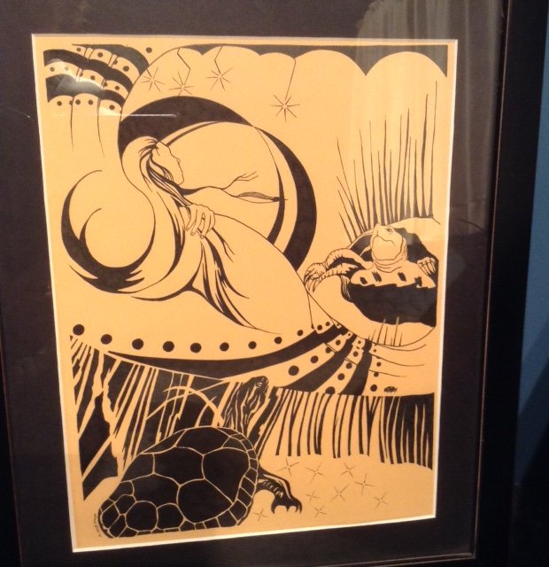
Turtles
I have decided to re draw a few original black ink drawings on the computer. Here is the first one entitled ‘Turtles’. Re drawing them using Inkscape (vectors) allows them to be printed, resized, colored, and edited if I choose.
Below is the original ink drawing, it was drawn on colored paper and framed with UV glass. I did change one or two things….

Good Spirits
The ‘Good Spirits’, often misinterpreted as ‘bad spirits’ because of their obvious expressions and devilish horns, was an image I found years ago in an old sepia photo. The ‘spirits’ were painted directly on the outside of a tipi and the intention was for these ‘beings’ to ward off or protect it’s inhabitants from actual ‘bad spirits’, enemies, and I’m sure anything with bad intentions (!)

Assiniboin: the painted medicine tipi of a man named ‘Nosey’ is made of canvas. The heavy cotton was supplied to reservations by the Government after the 1880’s, when the buffalo had been killed off and skins could no longer be used. -Fort Belknap Reservation, Montana, July 1906 (“Indians” by Joanna Cohan Scherer, Crown Publishers, Inc., New York.
The ‘Strawberry Festival’ which takes place when the ‘wild strawberry’ ripens, usually late June, is to thank the Creator for the return of this fruit. The timing coincides with the beginning of all remaining fruit which begins to ripen and can be harvested at this time.
My picture also incorporates a strawberry-design ash basket. This beautiful, labour intensive craft is traditional to the Mohawk people. I’ve never endeavoured to make one myself but appreciate the talent that is required to make these beautiful designs. The weavers use the ash tree, sweetgrass, dyes, various weaving styles and designs to create useful as well as beautiful baskets. Here’s an example of a weaver/artist: http://www.indiancraftshop.com/highlight_of_month/RobinLazore.htm
I created the central figure to be cocooned in leaves (Nature), blue sky/water (Life/Air) encircle, but I also made her/him look fragile, disjointed, broken. A person, depending on their life circumstances and at what instance you encounter them, can be either strong and impenetrable or weak and full of holes. I chose the latter in this instance. The need for the Good Spirits would obviously be more necessary at this vulnerable moment. Being enveloped in Nature, Tradition, other strong symbols of my culture, was to counter that state of being in a positive way. Combining this with the concept of the Strawberry Festival made me think of ‘renewal’/’ripening’/’change’/’giving thanks’….a contrasting but inevitable idea that occurs every year. Mother Earth goes on with her seasons and circle of life, death, ripening and renewal, with or without us.
© 2026 MohawkArtist
Theme by Anders Noren — Up ↑

Follow Along