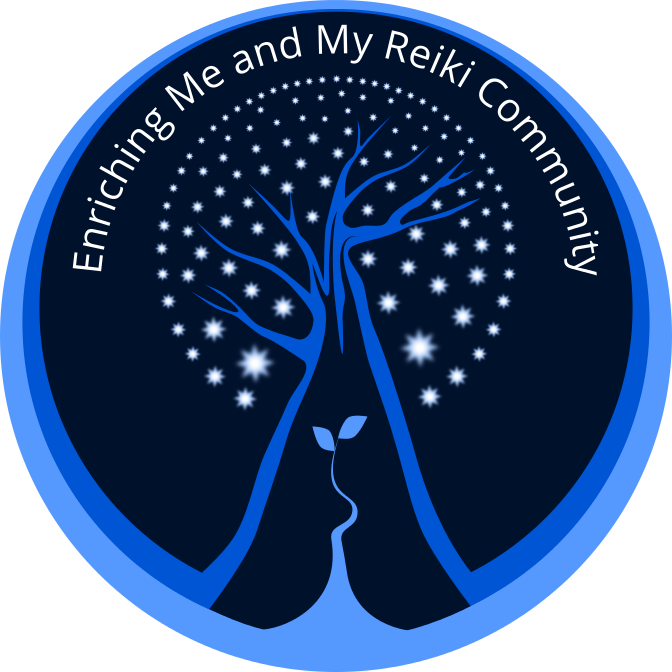
My Reiki Associates client is getting ready to hold their 2nd annual reiki conference this spring, entitled: “Enriching Me and My Reiki Community”. Speakers, workshops, exercises, and great food throughout the day will engage numerous practitioners, artists, and those seeking to learn more about reiki.
Looking to the future, for this to be an annual gathering, they requested a separate logo from their own branding. A substantial tree with numerous stars glowing through (they saw the light and energy of the stars to be representative of their community of practitioners and clients) is an image they wanted to employ.
The small shoot with two leaves growing from the base was suggested to add another layer of meaning to this logo. It was meant to represent new growth, change and re-birth; a fresh and organic energy which can be associated with the reiki practice. I felt that the smaller plant balanced out the larger and solid image of the tree.
Magazine/Newspaper Ads

A full-color ad used to promote the upcoming conference. I used the new logo and extended the colors to the rest of the space. Making each bit of information stand out on it’s own, with clarity and space so as not to feel crowded and without overtaking the main image was my goal for doing a small ad. The logo is completely scalable; keeping it sharp and appealing even when used at a very small size.

Follow Along