Design & original artwork for various craft breweries
 This design was scrapped but I thought it made more sense in that it was a clearer representation of the idea of this beer. Auto Pilot was a recipe which was the same as the original Pilot, just more of it (stronger flavours and more alcohol content). The small plane graphic was leaving a trail of smoke (or revealing the original label of Pilot which is a dark grey) that referenced the beer it was re creating. I also preferred the button to be red (as it matched the red button created in the name). I discovered in my research, that many auto pilot buttons are painted red to signify their importance. I also preferred the plane graphic detail bc it used the valuable real estate that is a label more creatively. Turning the beer (remember that labels are seen on a 3D object and not flat) while drinking it gave you something to look at.
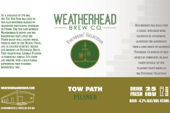
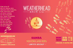
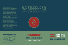 Although the original design was not mine, I re worked the colors and overhauled the artwork to be in line with the brewery's branding concept. Finalizing the brewery's branding to be consistent was making it easier to convey in social media. Consistent and more readable type, simplifying the logo, sizing of graphics and the addition of their full web and street address has made their look more appealing.
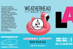 This was my work on completely re-designing the original artwork which was found to be too 'busy' (which rendered the description almost unreadable). My concept was to simplify the artwork as well as add the acronym 'LA' which everyone had quickly begun to call this beer anyhow (there was a problem with patrons forgetting the name or being unable to pronounce it easily). I thought this solution helped keep the original idea intact but made it more visually appealing and 'pronunciation friendly'!





Follow Along