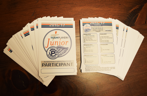
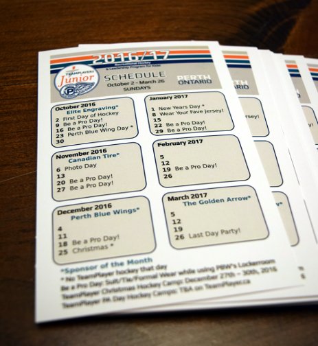
Lanyards printed! Clean lines, bright, sharp colors.
Category: Inkscape (Page 1 of 2)
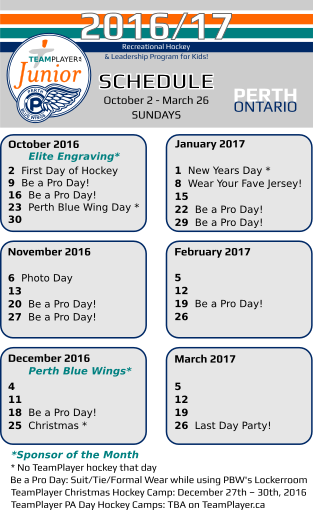
A continuation of the work for the new recreational hockey program to be started in Perth. A lanyard, to be handed out to all participants in this program, will be accompanied by another Perth Blue Wings ‘free entry’ pass to all their home games. The lanyard was created for some extra advertising and a place to display the names of some sponsors. It also serves as a hands-on schedule with reminders of upcoming events and hockey ‘theme’ days.
These are to be printed double sided on cardstock and fit into 4″ x 6″ plastic lanyards.
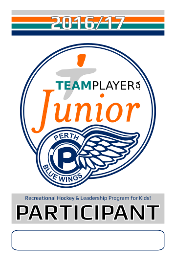
The new logo was the result of a new program initiated by TeamPlayer with the assistance of the Perth Blue Wings Junior Hockey Club. With no recreational hockey program being offered in Perth, TeamPlayer has decided to offer a Sunday morning program for kids who do not want to be in minor hockey (with the costs, time commitments, and emphasis on competitiveness, many kids are left out of the sport in small towns) yet still want to learn the sport.
The name of the new program is ‘Recreational Hockey & Leadership Program for Kids!‘ and the team will be called TeamPlayer Junior Blue Wings. My job was to combine both logo’s while making a new identity for a kids program. It’s always tricky attempting to combine two logo’s which are completely different in style and color and to unify them into a new identity. I always think ‘simpler is better’. By concentrating on using the one word ‘Junior’ and the color orange found on the TP logo as the section that stands out, I think it came together. By adding the the double blue circle, taken from the Blue Wings logo, to keep it looking uniform and in one shape also tidied it up.
A print ad was made for the local newspaper (see above). The logo was used on social media to get interest and registrants -mostly on Facebook by using their advertising feature which comes at a reasonable cost. The next step is working with the local printer to get hockey jerseys and possibly a couple of coaching jackets with this logo. I will follow up with pictures when that gets accomplished.
Slight change to this client’s logo…they are branching off and adding a new speaking series in November. So, why not add a small color detail to the logo which makes it POP! I think the leaf needed to be accentuated and it really is representing ‘growth’ as the client’s ideas are evolving into something more inclusive and …well kind of means they are ‘branching out’. 🙂
A lovely client had requested a re-do of her business’s brochure. I went with a fresh, cleaner look. I thought the butterfly needed to be simplified and more prominent. My intent was to keep her themes but to just step to the side slightly. I altered the color/text/imagery just enough to not be jarring and to keep her identity. I approach it like refreshing a room…on a budget 🙂 You don’t throw everything out, you just clean it up, re-paint, edit, pry open the windows, allow a little bit of FRESH in.
I have decided to re draw a few original black ink drawings on the computer. Here is the first one entitled ‘Turtles’. Re drawing them using Inkscape (vectors) allows them to be printed, resized, colored, and edited if I choose.
Below is the original ink drawing, it was drawn on colored paper and framed with UV glass. I did change one or two things….
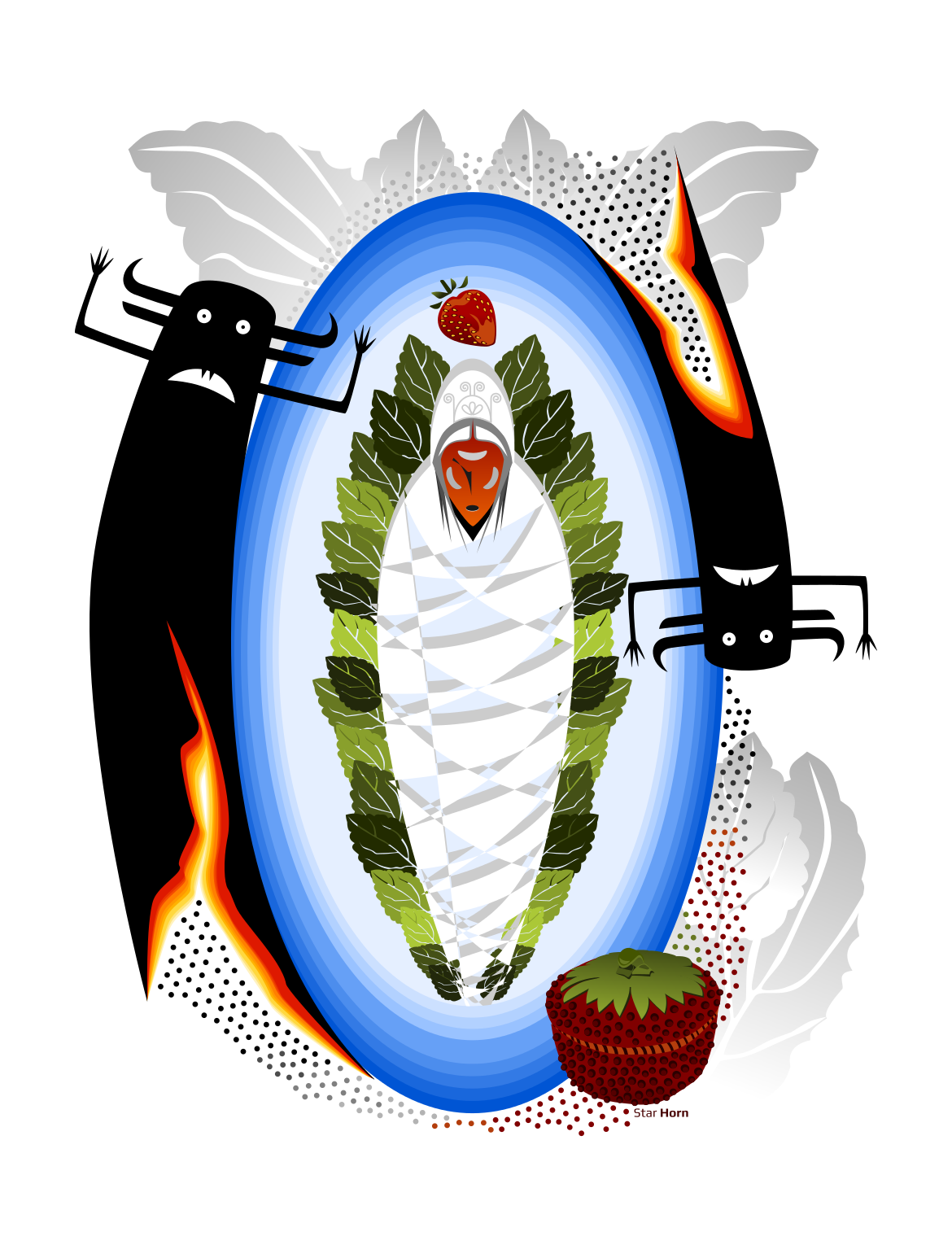
The ‘Good Spirits’, often misinterpreted as ‘bad spirits’ because of their obvious expressions and devilish horns, was an image I found years ago in an old sepia photo. The ‘spirits’ were painted directly on the outside of a tipi and the intention was for these ‘beings’ to ward off or protect it’s inhabitants from actual ‘bad spirits’, enemies, and I’m sure anything with bad intentions (!)

Assiniboin: the painted medicine tipi of a man named ‘Nosey’ is made of canvas. The heavy cotton was supplied to reservations by the Government after the 1880’s, when the buffalo had been killed off and skins could no longer be used. -Fort Belknap Reservation, Montana, July 1906 (“Indians” by Joanna Cohan Scherer, Crown Publishers, Inc., New York.
The ‘Strawberry Festival’ which takes place when the ‘wild strawberry’ ripens, usually late June, is to thank the Creator for the return of this fruit. The timing coincides with the beginning of all remaining fruit which begins to ripen and can be harvested at this time.
My picture also incorporates a strawberry-design ash basket. This beautiful, labour intensive craft is traditional to the Mohawk people. I’ve never endeavoured to make one myself but appreciate the talent that is required to make these beautiful designs. The weavers use the ash tree, sweetgrass, dyes, various weaving styles and designs to create useful as well as beautiful baskets. Here’s an example of a weaver/artist: http://www.indiancraftshop.com/highlight_of_month/RobinLazore.htm
I created the central figure to be cocooned in leaves (Nature), blue sky/water (Life/Air) encircle, but I also made her/him look fragile, disjointed, broken. A person, depending on their life circumstances and at what instance you encounter them, can be either strong and impenetrable or weak and full of holes. I chose the latter in this instance. The need for the Good Spirits would obviously be more necessary at this vulnerable moment. Being enveloped in Nature, Tradition, other strong symbols of my culture, was to counter that state of being in a positive way. Combining this with the concept of the Strawberry Festival made me think of ‘renewal’/’ripening’/’change’/’giving thanks’….a contrasting but inevitable idea that occurs every year. Mother Earth goes on with her seasons and circle of life, death, ripening and renewal, with or without us.
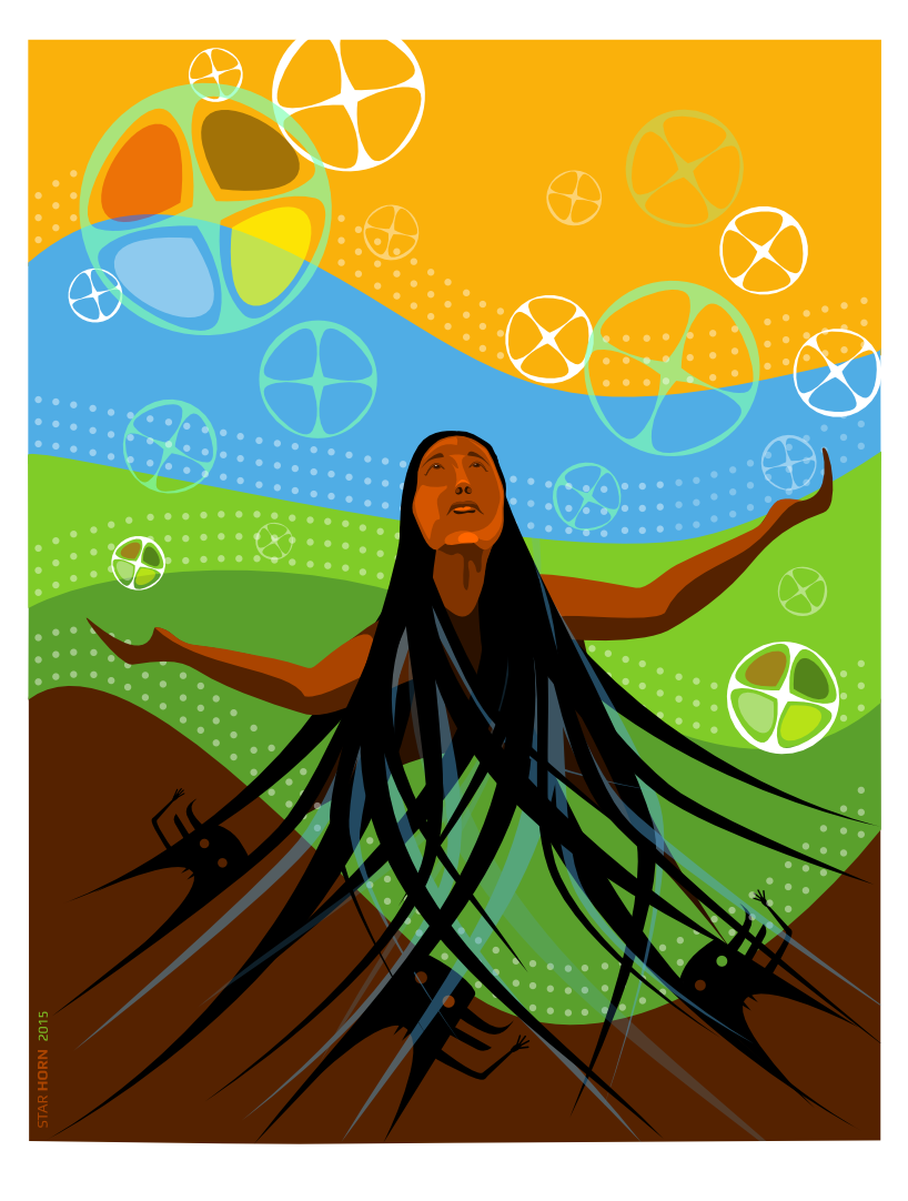
A piece I did this week. In light of the hundreds of murdered and missing Aboriginal women in this country and recent news of a missing 58 year old woman from just down the road from here (sadly she was found dead two days later, no foul play suspected) I was thinking of “loss”. How it would feel to not know, to be continually searching and looking, for a loved one.
My son and I left Walmart the other day and paused in front of the posters of missing persons they hang in the entrance. Some were recent, some from as far back as the 1970’s. Faces of children, young women, a few men, all being missed by families and friends, that had vanished never to be seen again were staring at us.
Emma Fillipoff has been missing since Nov 28, 2012, vanishing from in front of the Empress Hotel in Victoria, British Columbia, at the age of 26. Her mother resides nearby where I live. She is not someone I know personally, but I reflect often on what she is going through, even after all this time. Thankfully, I have no close relatives or friends who have vanished. Yet.
It sounds awful to say that but the odds are high that sooner or later it will hit closer to home. For a moment I tried to put myself in that position. What would it feel like to be missing someone? I could not stay in that feeling too long because I look down to my chest and feel the empty hole. I feel it with my senses even before I touch my chest or look with my eyes. It’s hollow and cavernous. It feels like a huge chunk of my chest has been removed and it’s difficult to breathe.
I’m sure for those who are constantly ‘looking’ or ‘waiting’ for news it’s actually a lot worse. But that is as much as I can imagine. From this feeling came the artwork I posted above.
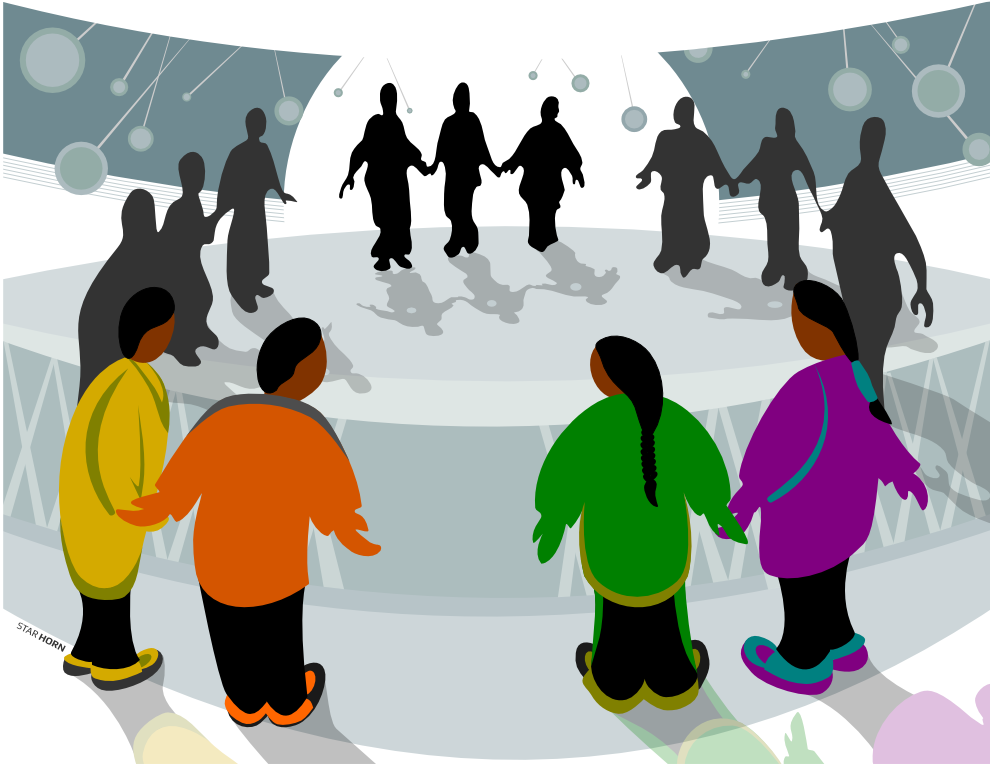
The ‘Round Dance’ has many meanings and several styles, depending on what Nation you come from. A few are mentioned here: http://www.cbc.ca/manitoba/scene/homepage-promo/2013/01/28/round-dance-revolution-drums-up-support-for-idle-no-more/
Or an alternative explanation:
http://www.native-drums.ca/index.php/Music/Social_Dance?tp=a&bg=1&ln=e
The Round Dance signifies a lot of things; the healing circle, the social gathering of community, a ceremony or festival, and even a form of grieving or celebrating through dance. The spaces in between the dancers represent missing members of the community. The friends and family left ‘searching’ look whole, but if you look closely (their shadows) they have holes in their chests. The darker dancers, drawn differently than those in the foreground, are my interpretation of the physical hardship that families go through. The dwindling of spirit directly affecting ones body. The faint outline of a drum, the ‘heartbeat’ of many traditional dances is under their feet. Without those missing friends, family and loved ones, the dance is broken and like a ‘community’ being broken, will not function properly. Dancers will be out of step, the enclosure is vulnerable without everyone clasping hands (a sign of support/strength/love/kinship), and those that are there will be ‘un-whole’.
I was commissioned to illustrate a cover for a conference agenda coming up in a couple of weeks. I emailed my printer to get a quote for something and instead he threw me some work. 7 Drawings, including this one, in 5 days or less (!)
I have swollen neck glands, headaches, stiff/sore neck, white spots on tonsils in back of throat…..but it’s WORK!! This is no time for wussies! zzzzzzzzzzzzzzzzzzzzzzzz





Follow Along