Kabeshinàn Minitig Pavilion on Victoria Island
(November 2017)
A beautiful character building to display some art and crafts right in the heart of Ottawa, Ontario.


Art. Design. Illustration. by Star Horn
Kabeshinàn Minitig Pavilion on Victoria Island
(November 2017)
A beautiful character building to display some art and crafts right in the heart of Ottawa, Ontario.
My Reiki Associates client is getting ready to hold their 2nd annual reiki conference this spring, entitled: “Enriching Me and My Reiki Community”. Speakers, workshops, exercises, and great food throughout the day will engage numerous practitioners, artists, and those seeking to learn more about reiki.
Looking to the future, for this to be an annual gathering, they requested a separate logo from their own branding. A substantial tree with numerous stars glowing through (they saw the light and energy of the stars to be representative of their community of practitioners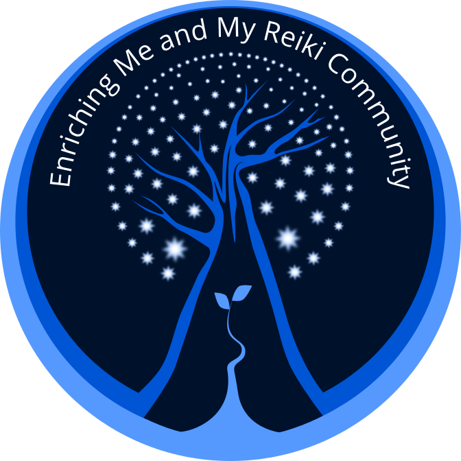 and clients) is an image they wanted to employ.
The small shoot with two leaves growing from the base was suggested to add another layer of meaning to this logo. It was meant to represent new growth, change and re-birth; a fresh and organic energy which can be associated with the reiki practice. I felt that the smaller plant balanced out the larger and solid image of the tree.

A full-color ad used to promote the upcoming conference. I used the new logo and extended the colors to the rest of the space. Making each bit of information stand out on it’s own, with clarity and space so as not to feel crowded and without overtaking the main image was my goal for doing a small ad. The logo is completely scalable; keeping it sharp and appealing even when used at a very small size.
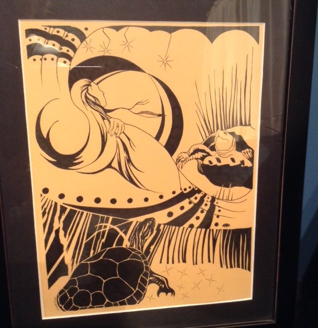
Some years back I drew this picture on a light yellow paper in black ink. Then before I thought carefully, I framed it at a good expense. Photographing it or scanning it before I did this would have been smart. But hindsight is 20/20!
It was part of a whole series of similar drawings using black and white, blank space, negative and positive space, real objects, natural objects, celestial objects, and imagined objects or beings. Most involved images interpreted from my own Mohawk background; clans, traditional clothing, myths, beliefs, common symbols and my love of the power & strength to be found in my people and the natural world (Mother Earth, animals, the sky, water, fire, etc).

By re drawing in Inkscape (a vector drawing program similar to Illustrator) I was able to play with the images. The new format allowed me to make reasonably priced copies, have the ability to re-size without losing any detail, and to add color if I chose. One would think that drawing on the computer would be a lot faster. It turns out to be somewhat more tedious and at times time consuming -a flowing whimsical thin line that grows gradually to become a thicker line made by using vectors becomes 10 times as long to sort out, were I to just grab a pencil and utilize my years of training, practice and intuition, it would be accomplished in 20 seconds!


Turtles
I have decided to re draw a few original black ink drawings on the computer. Here is the first one entitled ‘Turtles’. Re drawing them using Inkscape (vectors) allows them to be printed, resized, colored, and edited if I choose.
Below is the original ink drawing, it was drawn on colored paper and framed with UV glass. I did change one or two things….

Good Spirits
The ‘Good Spirits’, often misinterpreted as ‘bad spirits’ because of their obvious expressions and devilish horns, was an image I found years ago in an old sepia photo. The ‘spirits’ were painted directly on the outside of a tipi and the intention was for these ‘beings’ to ward off or protect it’s inhabitants from actual ‘bad spirits’, enemies, and I’m sure anything with bad intentions (!)

Assiniboin: the painted medicine tipi of a man named ‘Nosey’ is made of canvas. The heavy cotton was supplied to reservations by the Government after the 1880’s, when the buffalo had been killed off and skins could no longer be used. -Fort Belknap Reservation, Montana, July 1906 (“Indians” by Joanna Cohan Scherer, Crown Publishers, Inc., New York.
The ‘Strawberry Festival’ which takes place when the ‘wild strawberry’ ripens, usually late June, is to thank the Creator for the return of this fruit. The timing coincides with the beginning of all remaining fruit which begins to ripen and can be harvested at this time.
My picture also incorporates a strawberry-design ash basket. This beautiful, labour intensive craft is traditional to the Mohawk people. I’ve never endeavoured to make one myself but appreciate the talent that is required to make these beautiful designs. The weavers use the ash tree, sweetgrass, dyes, various weaving styles and designs to create useful as well as beautiful baskets. Here’s an example of a weaver/artist: http://www.indiancraftshop.com/highlight_of_month/RobinLazore.htm
I created the central figure to be cocooned in leaves (Nature), blue sky/water (Life/Air) encircle, but I also made her/him look fragile, disjointed, broken. A person, depending on their life circumstances and at what instance you encounter them, can be either strong and impenetrable or weak and full of holes. I chose the latter in this instance. The need for the Good Spirits would obviously be more necessary at this vulnerable moment. Being enveloped in Nature, Tradition, other strong symbols of my culture, was to counter that state of being in a positive way. Combining this with the concept of the Strawberry Festival made me think of ‘renewal’/’ripening’/’change’/’giving thanks’….a contrasting but inevitable idea that occurs every year. Mother Earth goes on with her seasons and circle of life, death, ripening and renewal, with or without us.

Broken Round Dance
A piece I did this week. In light of the hundreds of murdered and missing Aboriginal women in this country and recent news of a missing 58 year old woman from just down the road from here (sadly she was found dead two days later, no foul play suspected) I was thinking of “loss”. How it would feel to not know, to be continually searching and looking, for a loved one.
My son and I left Walmart the other day and paused in front of the posters of missing persons they hang in the entrance. Some were recent, some from as far back as the 1970’s. Faces of children, young women, a few men, all being missed by families and friends, that had vanished never to be seen again were staring at us.
Emma Fillipoff has been missing since Nov 28, 2012, vanishing from in front of the Empress Hotel in Victoria, British Columbia, at the age of 26. Her mother resides nearby where I live. She is not someone I know personally, but I reflect often on what she is going through, even after all this time. Thankfully, I have no close relatives or friends who have vanished. Yet.
It sounds awful to say that but the odds are high that sooner or later it will hit closer to home. For a moment I tried to put myself in that position. What would it feel like to be missing someone? I could not stay in that feeling too long because I look down to my chest and feel the empty hole. I feel it with my senses even before I touch my chest or look with my eyes. It’s hollow and cavernous. It feels like a huge chunk of my chest has been removed and it’s difficult to breathe.
I’m sure for those who are constantly ‘looking’ or ‘waiting’ for news it’s actually a lot worse. But that is as much as I can imagine. From this feeling came the artwork I posted above.
The ‘Round Dance’ has many meanings and several styles, depending on what Nation you come from. A few are mentioned here: http://www.cbc.ca/manitoba/scene/homepage-promo/2013/01/28/round-dance-revolution-drums-up-support-for-idle-no-more/
Or an alternative explanation:
http://www.native-drums.ca/index.php/Music/Social_Dance?tp=a&bg=1&ln=e
The Round Dance signifies a lot of things; the healing circle, the social gathering of community, a ceremony or festival, and even a form of grieving or celebrating through dance. The spaces in between the dancers represent missing members of the community. The friends and family left ‘searching’ look whole, but if you look closely (their shadows) they have holes in their chests. The darker dancers, drawn differently than those in the foreground, are my interpretation of the physical hardship that families go through. The dwindling of spirit directly affecting ones body. The faint outline of a drum, the ‘heartbeat’ of many traditional dances is under their feet. Without those missing friends, family and loved ones, the dance is broken and like a ‘community’ being broken, will not function properly. Dancers will be out of step, the enclosure is vulnerable without everyone clasping hands (a sign of support/strength/love/kinship), and those that are there will be ‘un-whole’.

Click on image for larger view
Still deciding if it is complete. Contemplating a touch of color…maybe not. It was made to be printed out at 11″ x 15″.

Assembly of First Nations Mental Wellness Policy Forum, Winnipeg, Manitoba 2015. Artwork: Star Horn
I was commissioned to illustrate a cover for a conference agenda coming up in a couple of weeks. I emailed my printer to get a quote for something and instead he threw me some work. 7 Drawings, including this one, in 5 days or less (!)
I have swollen neck glands, headaches, stiff/sore neck, white spots on tonsils in back of throat…..but it’s WORK!! This is no time for wussies! zzzzzzzzzzzzzzzzzzzzzzzz
Started a new digital drawing. There are are positives and negatives to using vectors to draw. Some sections are tedious, frustratingly difficult to manipulate and a lot slower than using a traditional pen or pencil. On the other hand, mistakes are eliminated or reworked, and filling in shapes become instantaneous. As an artist you can play a lot more, move things about, reshape, resize and re color to your hearts content. And FAST! No leaving the house for more pens, searching for paper….although I still start with a rough sketch in the sketchpad…For the style I am working with right now, Inkscape is pretty nifty.

This is a close up of one section of the drawing only

Click to view larger image
 Ok, so there was a LOST MOUTH GRUARD FIASCO this morning as we readied our son for hockey. Allowing him to sleep with us last night (something which is a ‘treat’ for him and at 9 years of age, we know will disappear soon enough) was nice and comforting, but there was just too much jostling, errant limbs, and not quite enough room to allow a solid night’s sleep. This tiredness leads to a loss of patience and gradual frustration which only made the morning fiasco that much worse. My head is foggy and a nap will be in order shortly. Otherwise my own evening hockey game will be yet another fiasco.
 I am teaching myself how to use WordPress in an effort to have more choices to offer clients. The immediate allure of the clean, crisp and simple layouts that WordPress offers is quickly replaced with hours of frustration, forum navigating, and Googling to find coherent answers. It seems I am not alone. I find numerous people, elite computer savvy individuals, asking the very same questions. The responses are often complicated. Much more complicated and confusing than what I thought WordPress was supposed to offer. After some trial and error, crying for help from my partner, and just plain luck, I seem to have gotten the basic hang of how to use a few of the templates.
I’ve decided to utilize this site to display my artwork. I already made a basic html website a year and a half ago but I thought adding another, where the chance of it being seen more was greater, couldn’t hurt.
My other website: http://www.okwari.ca/starhorn/
I’m not much of a writer so I gather it will be a site full of images. My work in various stages. Photos I take. Jewelry I make. And occasional rants.
© 2026 MohawkArtist
Theme by Anders Noren — Up ↑

Follow Along