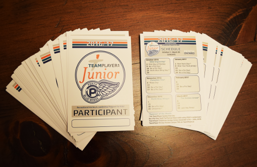
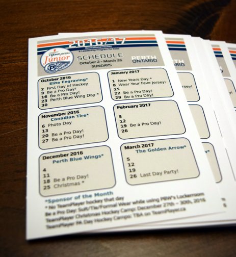
Lanyards printed! Clean lines, bright, sharp colors.
Tag: design
Slight change to this client’s logo…they are branching off and adding a new speaking series in November. So, why not add a small color detail to the logo which makes it POP! I think the leaf needed to be accentuated and it really is representing ‘growth’ as the client’s ideas are evolving into something more inclusive and …well kind of means they are ‘branching out’. 🙂
A lovely client had requested a re-do of her business’s brochure. I went with a fresh, cleaner look. I thought the butterfly needed to be simplified and more prominent. My intent was to keep her themes but to just step to the side slightly. I altered the color/text/imagery just enough to not be jarring and to keep her identity. I approach it like refreshing a room…on a budget 🙂 You don’t throw everything out, you just clean it up, re-paint, edit, pry open the windows, allow a little bit of FRESH in.


Follow Along